
Summary
The design team relied on a purchased UI kit without a unified system, leading to brand-specific inconsistencies and no design foundation for internal tools. This created inefficiencies for both designers and developers. I participated in the overhaul, auditing legacy code and collaborating cross-functionally to build a scalable, token-based system that streamlined workflows, improved consistency, and supported multiple brands.
Skills
+Design systems
+User research
+Prototyping
+User testing
+Workflow optimization
Role
Intermediate product designer
Team
Myself, 2 Designers, 1 Design Manager, 4 Engineers
Context
PurposeMed is a healthcare platform with 3 products
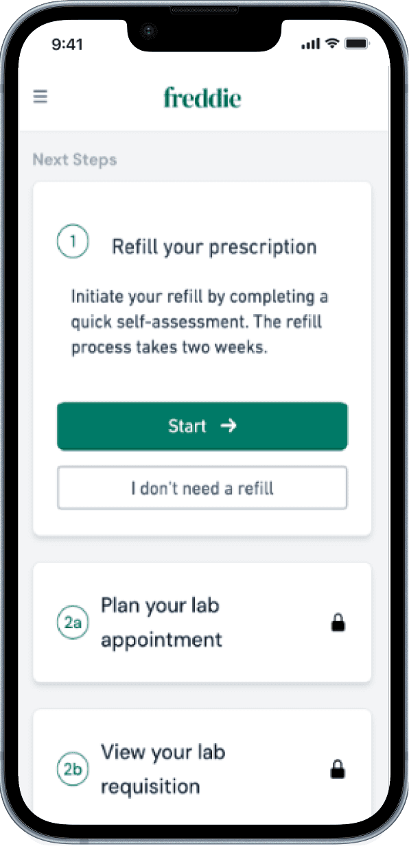
Patient facing apps
• Freddie - for HIV prevention
• Frida - for ADHD care
Provider facing app
• PurposeMed - a clinician facing app
Problem
As PurposeMed expanded into multiple clinical verticals, the absence of a cohesive design system led to inconsistencies, inefficiencies, and missing components, forcing designers and developers to create ad hoc solutions, wasting time, and disrupting workflows.
Problem
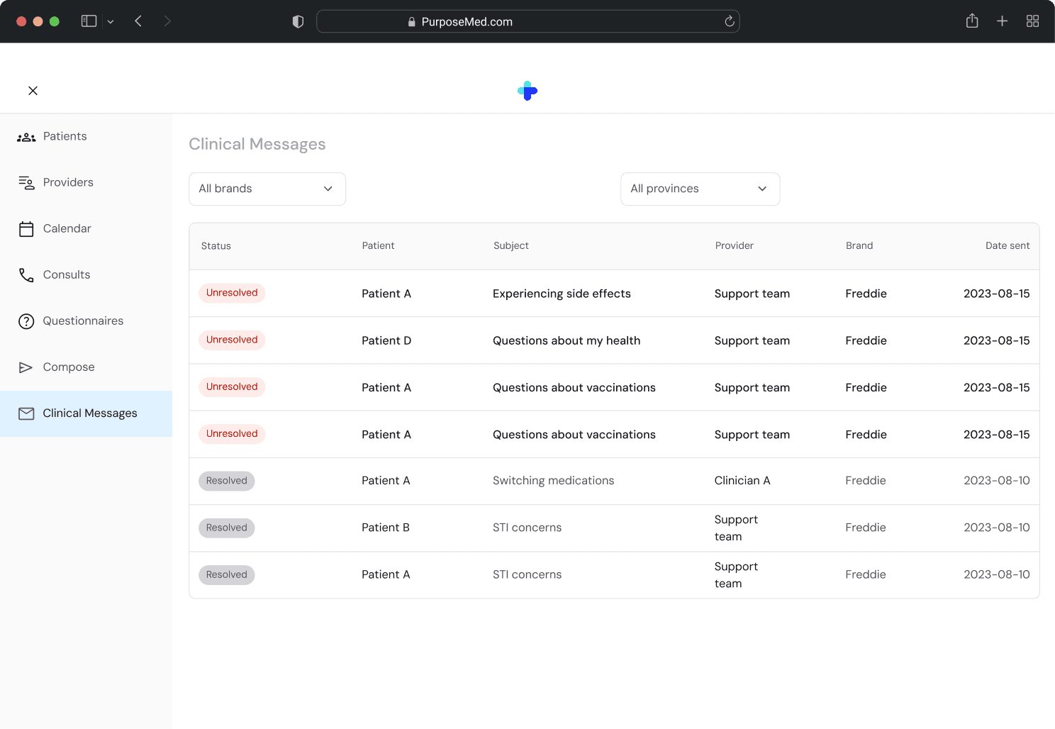
The clinician-facing app had no design system, leading to one-off solutions and inconsistent legacy UI. On the patient side, apps like Freddie and Frida were using an outdated third-party UI kit that wasn’t built to scale.

Problem
Components were duplicated across files and brands. Each brand had its own version of the same component.
Foundational elements like spacing, typography, and color tokens were missing or mismatched.
Freddie component

Frida component

PurposeMed component

Goal
How might we create a unified design system that ensures consistency, reduces inefficiencies, and supports both the client facing and internal facing apps?
Discovery
We conducted an in-depth audit of the existing system, mapping legacy components across patient and provider apps, identifying gaps, and defining shared components for a unified design system.

Discovery
We then introduced a two-tier design token system using Figma Variables:

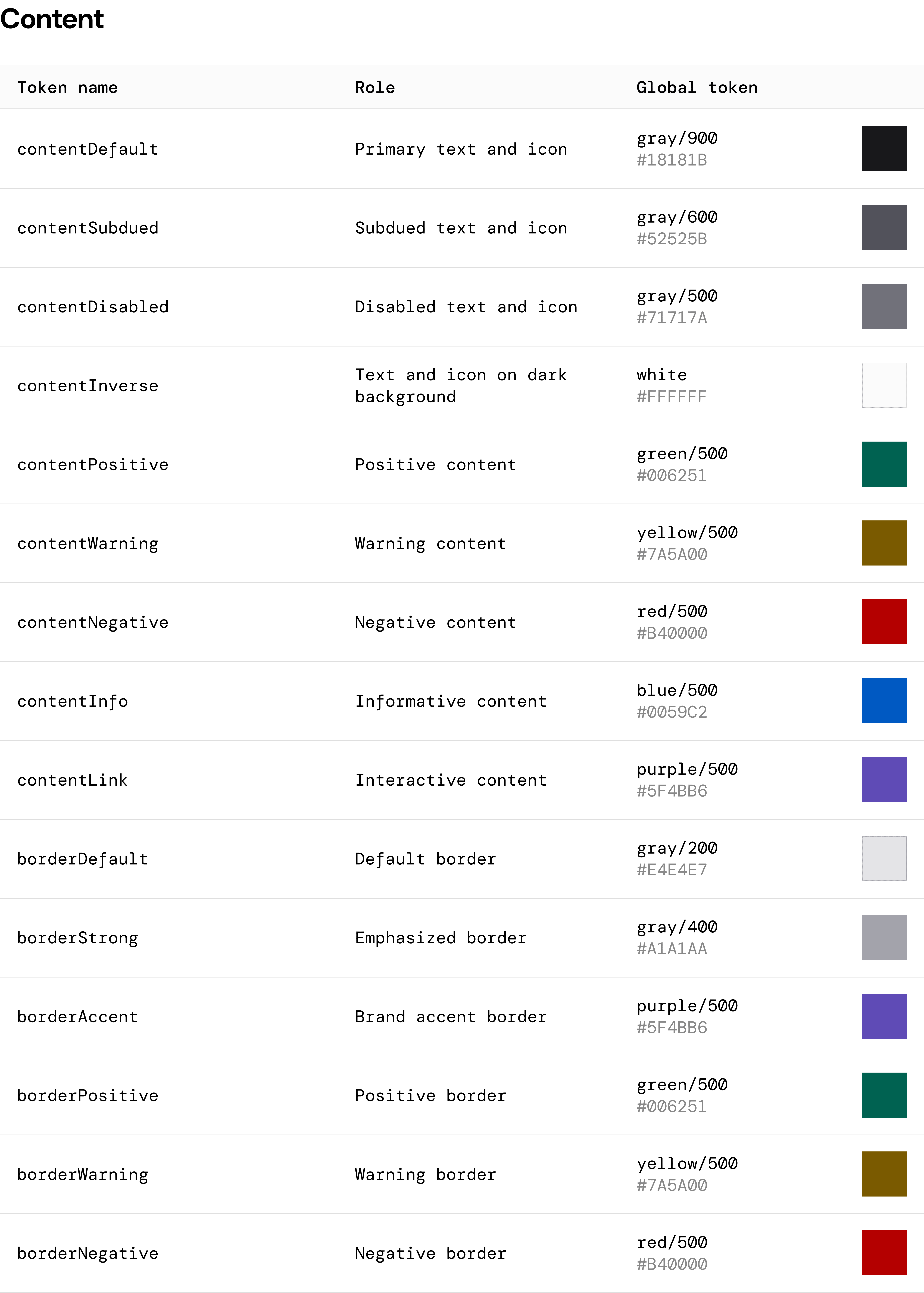


Discovery
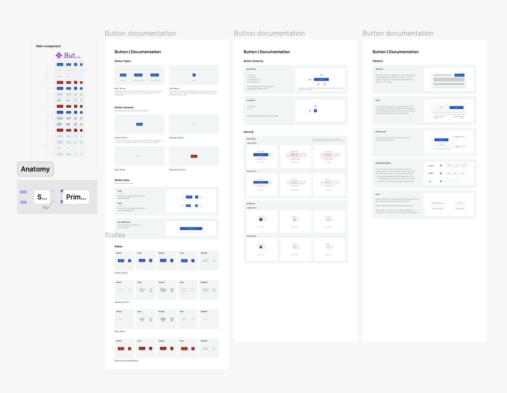
We structured the design system files based on component and token types, ensuring clear organization for easy access and scalability.


Planning
We built components incrementally, only as real use cases emerged — helping ensure relevance and adoption. Rather than rebuilding everything, we reused Tailwind classes and patterns where possible.
Solution
Variable styling tokens allow all brands to share the same components while instantly adapting colors, typography, and styling—ensuring consistency and reducing redundancy.

Discovery
We established clear file naming, thorough documentation for context, and ensured components supported multiple use cases. New components were created only when necessary, with design token foundations maintaining brand unity.
Planning
We collaborated with developers to implement the design system in Storybook, removing duplicates and establishing a phased rollout, starting with foundations and adding components as needed. New components were designed for versatility and scalability.

Outcomes
• Enabled faster onboarding of new designers
• Reduced duplicate components from 150+ to 40
• Improved design-dev alignment and speed of implementation
• Scaled to support a new product launch with minimal design lift
Takeaways